

While reviewing sustainability reports that have achieved various awards, I found a couple different reports that had visuals that I found particularly useful for different reasons. Tying materiality to the Sustainable Development Goals (SDGs) is a critical part of a lot of the best sustainability reports. Antwerp Management School (AMS) conducted a materiality assessment where they had staff and students choose their top 5 SDG topics to better understand the most important categories. Bar charts are some of the most effective ways to visualize numbers because humans are able to understand the patterns quickly and easily, however, choosing between stacked or grouped bar charts can be difficult if trying to convey comparisons within a whole or to compare various wholes (Turabian 2018, 93-95). AMS came up with a very clean and easy to read method for showcasing both stacked and grouped bar charts in one graphic to allow for both types of understandings.

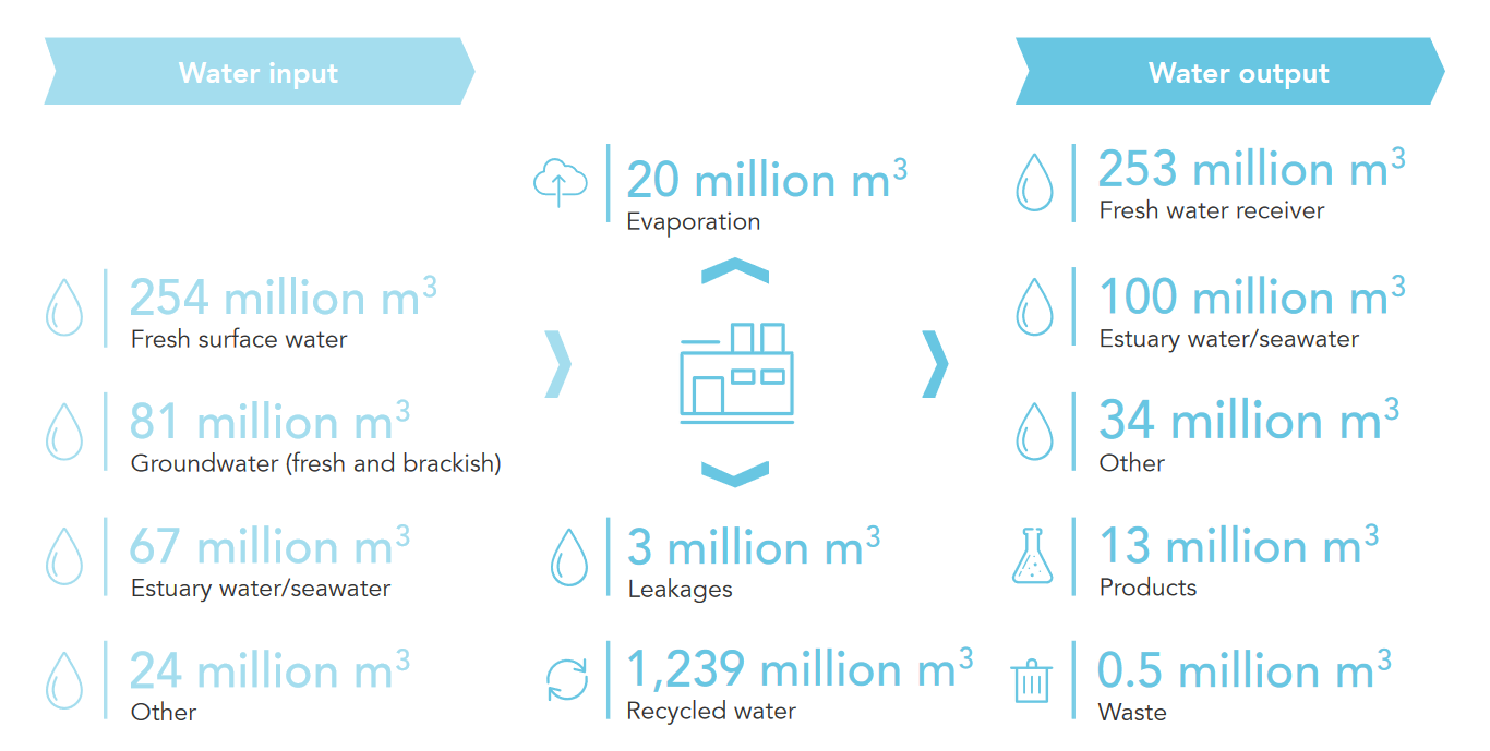
Another graphic that I found particularly useful came from Solvay’s 2019 Annual Integrated Report. This graphic does not follow a standard data graphic format as listed in the Turabian manual, however, it is a collection of data points arranged in a process flow diagram that makes it very easy to visually understand the inputs and outputs that their operations have with regard to water. This innovative approach makes complex process metrics easier to understand versus a simple data table or messy flowchart.
Author: Logan Callen
References
Antwerp Management School. 2020. “Sustainability Progress Report 2020.” Accessed February 24, 2021. https://blog.antwerpmanagementschool.be/hubfs/_Downloadables/Corporate/AMS_Sustainability_Progress_Report_2020.pdf.
Solvay. 2019. “Progress Beyond: 2019 Annual Integrated Report.” Accessed February 24, 2021. https://annualreports.solvay.com/2019/en/.
Turabian, Kate L. 2018. A Manual for Writers of Research Papers, Theses, and Dissertations: Chicago Style for Students and Researchers. 9th. Chicago: The University of Chicago Press.
0 comments on “Visualizations in Sustainability Reports”Add yours →